5 Reasons Your Website Aren’t Converting Visitors Into Customers
— August 29, 2014You’ve taken the important step of moving your business online and building a web application to attract potential customers. Congratulations—your digital door is now open! However, if your sales aren’t meeting expectations, you may wonder why. S3Corp, a leader in software outsourcing in Vietnam, has identified five common website pitfalls that can drive potential customers away. Understanding these insights can help transform your website into a powerful tool for growth.
1. Overloading with Information – Keep It Short and Simple
The classic “K.I.S.S.” principle—Keep It Short and Simple—applies not only to writing but also to web design. When visitors arrive at your website, they don’t have time to wade through dense paragraphs or unnecessary details. Clear, focused content is essential. Streamline your messaging by:
- Highlighting key product information upfront.
- Using short, impactful descriptions to maintain attention.
- Placing clear, clickable Call-to-Action (CTA) buttons in prominent locations to guide the customer journey smoothly.
Too much information can quickly become overwhelming, leading to a higher bounce rate. A clean, concise layout is key to creating a customer-friendly experience.
2. Hidden Shopping Cart – Ease of Navigation is Essential
Imagine carefully selecting items to purchase only to find that you can’t locate the shopping cart. Frustrating, right? A hidden or hard-to-find shopping cart can directly affect sales conversions. Viewing your site from the perspective of an online shopper can help identify and address navigational issues:
- Ensure the shopping cart icon is visible on every page.
- Use a clean layout with easy-to-access options.
- Make checkout quick and intuitive, minimizing any friction for users.
At S3Corp, we prioritize user-friendly designs and smooth navigation to create seamless shopping experiences that lead customers to conversion.
3. Missing Testimonials – Leveraging Social Proof
One of the biggest challenges of e-commerce is building trust. Shoppers often feel uncertain when purchasing online, which is why social proof is invaluable. Positive reviews and testimonials reassure potential customers that they’re making a sound choice.
- Add a dedicated section for testimonials on your website.
- Regularly update testimonials to keep them fresh and relevant.
- Encourage customers to share their honest opinions, demonstrating your confidence in your offerings.
Featuring real feedback from other buyers makes it easier for new visitors to envision a positive experience with your products or services, increasing their likelihood of making a purchase.
4. Insufficient Contact Information – Building Trust Through Accessibility
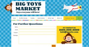
A visible and comprehensive contact section can significantly boost a visitor’s confidence. Imagine browsing an online store and wanting clarification on a product, only to find there’s no way to reach out. It’s likely you would abandon your cart. To prevent this, make contact information easy to access:
- Place a phone number in a consistent location on each page.
- Include a physical address and email for added credibility.
- Consider using an interactive contact form that allows customers to reach out directly.
Providing multiple ways for customers to get in touch indicates that your business is accessible and transparent, strengthening their trust in your brand.
5. Neglecting Your Unique Selling Point – Stand Out from the Crowd
In a crowded online market, it’s critical to communicate what makes your business unique. Whether it’s a specific quality of your product, exceptional customer service, or a standout feature, highlighting these Unique Selling Points (USPs) helps differentiate you from competitors.
- Clearly communicate your strengths on your homepage and product pages.
- Use engaging visuals and concise text to reinforce what sets you apart.
- Emphasize customer benefits such as free shipping, personalized service, or exclusive product designs.
A well-defined USP can be the deciding factor that converts a casual browser into a committed customer, making it essential for any business looking to enhance its online sales.
Wrapping Up: Your Path to a Better Customer Experience
A successful website does more than display products—it guides customers seamlessly through the buying journey, builds trust, and showcases what makes you unique. By avoiding these common mistakes, you create a streamlined, user-friendly experience designed to attract and retain customers.


