7 MOBILE APP ONBOARDING TIPS THAT INCREASE USER RETENTION
— February 15, 2016
7 Secrets to Boosting Mobile App User Retention
Creating an effective mobile app onboarding experience is essential for boosting user retention and long-term engagement. A well-structured onboarding process not only minimizes user abandonment but also establishes a strong foundation for user satisfaction and loyalty. Here are detailed insights and actionable strategies to craft a seamless and impactful onboarding journey for your app users.
Build the Path of Least Resistance
The cornerstone of user onboarding is simplicity. Users should find it effortless to start using your app. Any barriers in signing up, logging in, or navigating the app can lead to high abandonment rates. A straightforward, user-friendly process significantly improves the chances of retaining users. For example, many social media and entertainment apps employ a single sign-up screen to minimize user effort. This approach works especially well when the app’s functionality is intuitive or familiar to users.
However, not all apps benefit from a single-screen approach. Depending on the app’s utility or whether it introduces a novel concept, various onboarding methods can be employed. A benefits-oriented approach communicates the app’s value, helping users understand its unique selling points. A function-oriented strategy demonstrates key features, making the app’s utility clear. Progressive onboarding, which guides users through interactions step-by-step, is useful for apps with more complex functionalities. A hybrid method combines these strategies to create a comprehensive onboarding experience. No matter which method you choose, your priority should be to reduce friction and make the onboarding process as intuitive as possible.
Reduce Sign-Up and Log-In Fields
Long forms are a significant deterrent for mobile users, particularly due to the limitations of small screens. Simplifying the process by allowing users to sign up or log in with a single field, such as a social media account, is an ideal solution. For apps that require additional information, such as service-based applications, it is crucial to gather only the most essential data. Breaking down the process across multiple screens can make it feel less overwhelming.
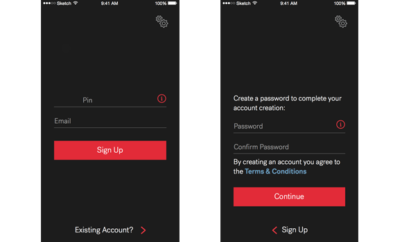
For example, in an app developed for a home services company, dividing the sign-up process into multiple steps helped users navigate the form easily without feeling burdened. This segmentation ensures that users can progress smoothly while still providing the necessary information.
Follow the “One Screen, One Concept” Rule
Users process information more effectively when it is presented in small, manageable chunks. The “one screen, one concept” rule is a fundamental guideline in designing onboarding screens. Each screen should convey a single, clear idea, whether it’s explaining a feature or showcasing a benefit. This prevents information overload and keeps users focused.
For instance, a benefits-oriented onboarding flow might dedicate one screen to explain how the app saves time, while another screen highlights cost savings. This segmented approach ensures users can quickly grasp the app’s value without feeling overwhelmed.
Give Feedback Quickly and Effectively
Timely feedback plays a pivotal role in onboarding. Whether it is validating form inputs, confirming successful actions, or highlighting errors, feedback keeps users informed and engaged. For example, if a user enters a weak password, the app should immediately indicate the issue and provide clear instructions to resolve it. This reduces frustration and ensures users can move forward confidently.
In addition to error messages, positive reinforcement through animations or visual cues can enhance the onboarding experience. Simple, purposeful animations—such as checkmarks or progress indicators—can acknowledge user actions, making the process more satisfying.
Use Guided Interaction to Drive Progress
Progressive onboarding, which introduces users to the app through guided interactions, is especially effective for more complex applications. This method mirrors the approach often seen in video games, where users learn controls and features by playing rather than following lengthy tutorials. By encouraging exploration, guided interaction helps users become familiar with the app naturally.
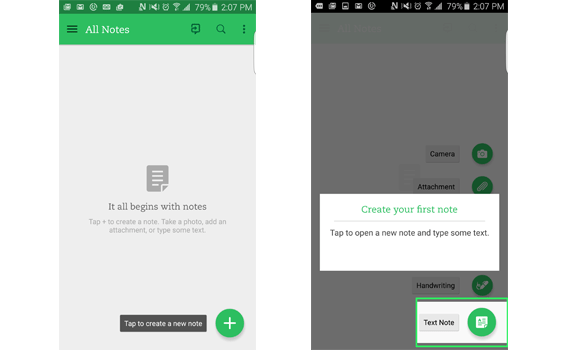
For example, Evernote uses guided interaction to teach users how to create notes and manage their workspace. This approach is particularly useful for apps with “empty states,” where users must take an action (e.g., creating a note or uploading content) to populate the interface. By integrating discovery into the onboarding process, apps can maintain user engagement while educating them on core functionalities.
Use Animation Purposefully
Animations can enhance onboarding when used thoughtfully. They should draw attention to specific elements, provide feedback, or create a sense of continuity without overwhelming users. For instance, subtle animations can guide users to undiscovered features or indicate progress through pagination dots.
Purposeful animations also help users understand spatial relationships within the app. For example, sliding transitions between screens can give users a sense of moving forward without disrupting their experience. However, it is essential to use animations sparingly to avoid distracting or irritating users.
Continuously Test and Optimize
User onboarding is a dynamic process that requires constant refinement. By analyzing user feedback and behavioral data, you can identify pain points and areas for improvement. Testing different onboarding approaches and monitoring user responses can reveal what works best for your audience.
For example, if users frequently abandon the app during a specific step, revisiting that part of the process and experimenting with alternative designs can yield better results. A/B testing is an effective way to compare different onboarding strategies and measure their impact on user retention and engagement.
Importance of Effective Onboarding in Vietnam’s Mobile App Market
In Vietnam, the demand for mobile app development has grown rapidly. Companies like S3Corp, specializing in web and mobile outsourcing, emphasize the critical role of user onboarding in driving app success. A poorly designed onboarding process can lead to abandonment rates as high as 25%, as seen in 2015. Conversely, a seamless onboarding experience can significantly boost user retention and lifetime value, helping businesses achieve their growth objectives.
Conclusion
An effective onboarding process is essential for engaging users and fostering loyalty. By simplifying user journeys, providing clear feedback, and leveraging guided interactions, you can create a positive first impression that keeps users coming back. Regular testing and optimization ensure your onboarding process remains aligned with user needs and expectations. Adopting these best practices will not only enhance user retention but also set your app apart in a competitive market.


