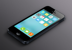
Optimizing Your App Layout for iOS 7
— October 24, 2016
Creating an effective layout for your app on iOS 7 can enhance user experience, making your app more intuitive and accessible. While layout design has no absolute right or wrong approach, some key techniques can ensure optimal usability. Follow these guidelines to create an app that is easy to navigate and user-friendly on iOS devices.
—
1. Ensure Ample Control Space
Smartphone screens are small, and iPhones, in particular, have relatively limited screen space. To make your app easy to use, provide ample space for key control elements.
- Use 44×44 Points for Main Controls: Key touchable areas should be at least 44×44 points. This size allows users to tap or swipe elements comfortably with one finger, even when using their phone one-handed.
- Focus on One-Hand Usability: Since many users interact with apps on the go, this minimum control size helps avoid accidental taps and makes navigating essential features quick and straightforward.
2. Draw User Attention to Key Elements
Guide the user’s focus to the app’s main elements. This not only improves the usability but also enhances navigation flow.
- Positioning: Place important items in the top-left corner of the screen. Since users in many cultures read left to right and top to bottom, they’re more likely to look in this area first. Reserve less essential items, such as privacy policies or terms and conditions, for the bottom-right corner.
- Use Size to Indicate Importance: Larger elements naturally attract more attention. Increase the size of essential items so they stand out visually. Larger elements also improve accessibility, making it easy for users to complete high-priority actions quickly.
3. Group Related Elements Effectively
Clear organization in your app’s layout helps users understand which elements are connected and prevents confusion.
- Alignment and Indentation: Group related items by aligning and indenting them in the same way. For instance, if you include images with accompanying text, align them consistently to indicate they are related. This organizational technique makes it clear which content goes together.
- Consistency in UI Elements: Elements with similar functions should have similar appearances. For example, all buttons that navigate between pages could share a color and shape. A consistent UI reinforces the structure of your app, making it easy for users to intuitively understand how to interact with it.
4. Use Text Sizes That Adapt to User Preferences
Many iOS users adjust their default text settings to accommodate personal preferences or visual impairments. Ensuring that your app responds to these settings can make it more user-friendly.
- Adopt Dynamic Type: Dynamic Type adjusts font size, line spacing, and height to meet the user’s settings. Dynamic Type can also separate text types, such as headings and body text, automatically. This adaptability improves readability, especially for users with low vision or those who prefer larger text.
- Choose One Font: Using a single font across your app helps prevent rendering issues across different text sizes and types.
- Make the Layout Responsive to Text Size Changes: For apps with text-dense layouts, consider a responsive design that adjusts to larger text sizes. For instance, in a two-column layout, consider shifting to one column if the user opts for text sizes larger than 17 points. This change enhances readability without compromising the layout.
—
Summary
These best practices for iOS 7 app layout ensure a smooth, enjoyable user experience. By providing ample control space, guiding attention with element size and position, grouping related content clearly, and adapting text sizes to user preferences, you create a layout that users will find intuitive and accessible. These design decisions can ultimately improve user satisfaction and help your app stand out in a competitive market.
Optimize your app with these principles for an improved iOS 7 experience!


