5 Things to Consider When Designing Your Mobile App
— February 22, 2016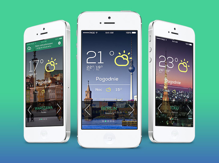
5 Key Considerations for Mobile App Design
Designing a mobile application requires strategic planning and careful consideration of various factors. This guide breaks down five essential aspects to help you create a successful mobile app. By understanding these elements, you can optimize user experience, functionality, and overall design.
Weighing the Options: Mobile App or Mobile Website
The first decision is determining whether to create a mobile application, a mobile-optimized website, or both. This choice depends on your goals, the type of interaction you aim to provide, and the needs of your target audience.
Mobile apps are often ideal for tasks requiring intensive engagement or specific device functionalities, such as gaming, utilities, or offline capabilities. For example, note-taking apps or calculators perform better as standalone applications since they often do not rely on an internet connection. Apps also allow deeper integration with the mobile operating system, utilizing features like GPS, the camera, or push notifications.
In contrast, a mobile-optimized website is often more accessible across devices. It is ideal for companies that prioritize broad compatibility without requiring deep device integration. For instance, a business focusing on e-commerce may prioritize a responsive web experience to ensure users on all devices have equal access to its platform.
When considering this, reflect on your current digital presence. If you already have a full-featured website, assess whether your app would replicate those functions. If the app merely recreates your website, it might be more efficient to invest in enhancing your mobile website.
Understanding Where the App Will Be Used
Once you decide to proceed with an app, consider its primary use case and environment. Context plays a pivotal role in app design and functionality.
Apps used on the go, such as navigation or fitness trackers, must prioritize accessibility. Key functions should be easy to find and interact with, even when users are moving. Buttons and menus should be large enough to click without precise movements. In contrast, apps used in stationary settings, such as while commuting on a train, benefit from clear, readable text and intuitive navigation.
For apps focused on selling products or services, prioritize user-friendly purchasing flows. Ensure that pricing, cart buttons, and checkout processes are easy to see and navigate. This clarity can make the difference between a completed transaction and user frustration.
Additionally, understanding user behavior can inform your design choices. For example, a geo-location app in Vietnam might require distinct customization based on popular travel or business needs in the region. By tailoring features to the app’s environment, you increase its practical value to users.
Designing for Various Screen Sizes
Screen sizes and resolutions differ significantly across devices, even within the same platform. Ensuring a consistent and seamless experience across these variations is crucial for user satisfaction.
For Android devices, screen sizes range widely due to the diversity of manufacturers. Designing scalable user interface (UI) elements helps maintain visual and functional consistency. Android developers should reference guidelines on supporting multiple screen sizes to optimize layout, graphics, and resolution.
Apple’s devices, while more standardized, also present challenges. For example, the iPhone 4 introduced the Retina display, doubling pixel density. Developers must ensure that app graphics remain crisp on such high-resolution screens without impacting performance on older models. Techniques like designing with vector-based assets can simplify these adjustments.
Neglecting screen size considerations risks alienating users. A poorly scaled app might render text unreadable or buttons inaccessible on smaller screens, detracting from usability. To address this, thorough testing on a range of devices ensures consistent quality.
Adhering to User Interface Conventions
Consistency in UI design enhances user comfort and app usability. Users are more likely to adopt an app if its interface feels familiar and aligns with established patterns for the platform.
Each platform—whether iOS, Android, or BlackBerry—has detailed guidelines outlining UI conventions. These guidelines cover icons, navigation patterns, menu placements, and more. Following them ensures your app integrates seamlessly into the broader ecosystem of that operating system.
For instance, Apple’s Human Interface Guidelines recommend intuitive gestures like swiping or tapping for navigation. Android’s guidelines emphasize material design principles, promoting clean layouts and responsive animations. Developers should review these resources to align with best practices.
Breaking conventions can sometimes lead to innovative designs but often comes at the cost of user confusion. For example, a novel navigation method might deter users accustomed to standard back or home buttons. By sticking to familiar UI structures, you can reduce the learning curve and improve app adoption rates.
Designing for Touch Interaction
Most mobile apps rely on touch interfaces, so designing with ergonomics in mind is essential. Effective touch design prioritizes ease of interaction, regardless of hand size or device orientation.
Begin by analyzing how users typically hold their devices. The placement of key controls should align with natural thumb movements. Many apps place navigation menus at the bottom of the screen for this reason. This positioning minimizes hand strain and ensures quick access to core features.
Touch feedback is another vital aspect. Visual cues, such as buttons that change color or expand when pressed, reassure users that their actions have been registered. For example, the iPhone’s keyboard enlarges keys upon touch, providing immediate feedback. While haptic feedback can enhance certain experiences, visual indicators generally work better for day-to-day interactions.
Incorporating gestures like swiping, pinching, or tapping enriches the user experience. However, these gestures should complement rather than replace traditional navigation options. Clear onboarding tutorials can help users understand how to interact with these features.
Conclusion
Designing a mobile app involves careful planning and attention to detail across several key areas. From choosing between a mobile website and an app to considering screen sizes and touch interfaces, each decision impacts the app’s usability and success. By prioritizing these elements, you create an app that not only meets user needs but also stands out in a competitive market.
For businesses exploring app development in Vietnam or leveraging outsourcing services, these considerations are especially relevant. Partnering with a skilled team like S3Corp can help you navigate these complexities, ensuring your app achieves its full potential.

About author


