10 Web Design Trends to Try in 2017
— February 27, 2017As we enter a new year, it’s an opportune moment to reassess your existing website or embark on new digital projects. By integrating the latest design trends, from functional improvements to innovative visual concepts, you can create a website that is both aesthetically pleasing and user-friendly.
Let’s explore some of the emerging trends that are shaping the digital landscape for 2017.”
Gradients: The Return of Bold Color Transitions
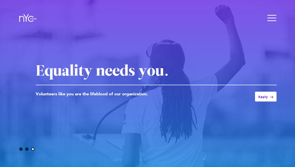
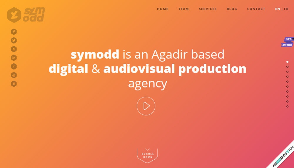
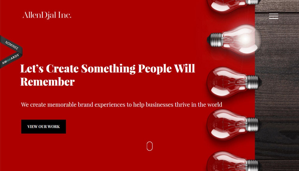
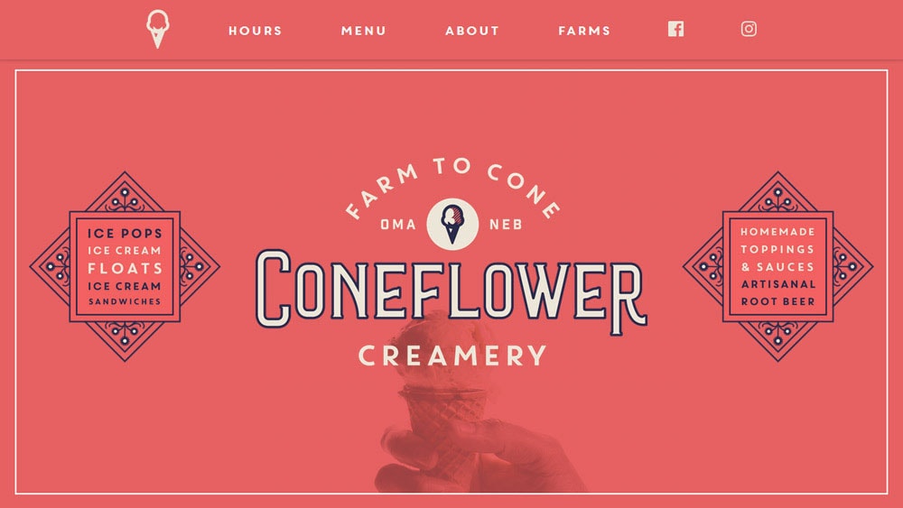
Gradients are back in web design but with a fresh perspective. Gone are the days of subtle, understated transitions like those once found in Apple’s iOS icons. In 2017, gradients are bold, vibrant, and unapologetically colorful. These vivid color transitions breathe life into designs, making them eye-catching and dynamic.
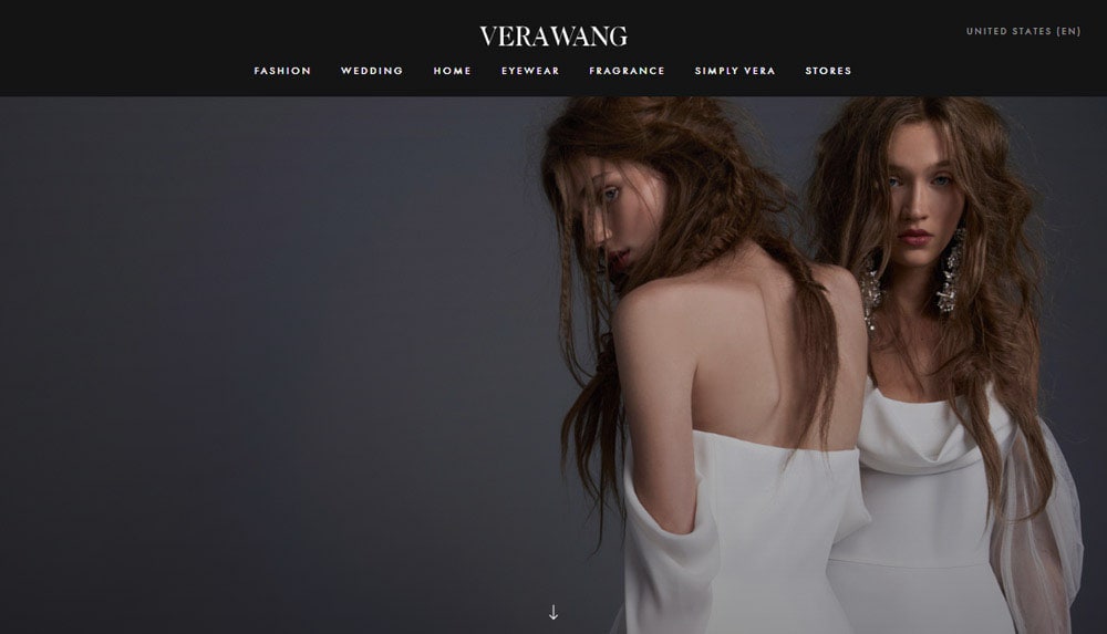
One of the most striking uses of gradients is as a two-color overlay on photos. This technique elevates even mundane images, creating visual intrigue that grabs users’ attention. Additionally, gradient backgrounds are becoming popular as standalone elements. They effectively draw the eye and can fill spaces where other imagery might not fit. Whether for enhancing a website’s visual appeal or creating an immersive experience, gradients are a trend to embrace this year.
Video with Sound: A Cinematic Experience Online
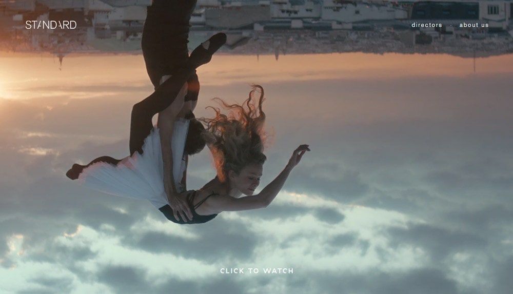
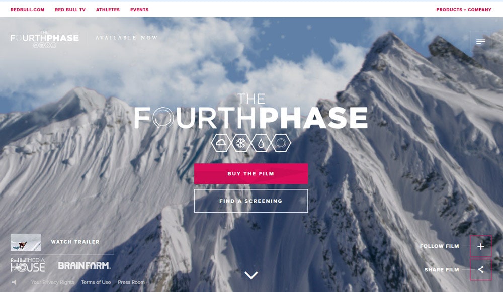
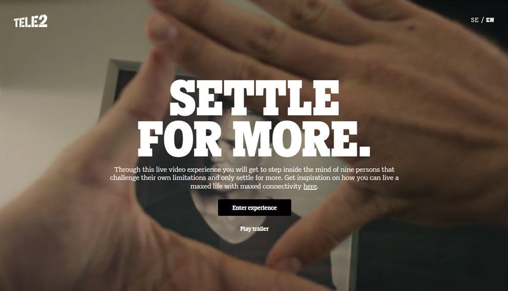
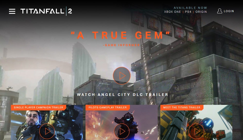
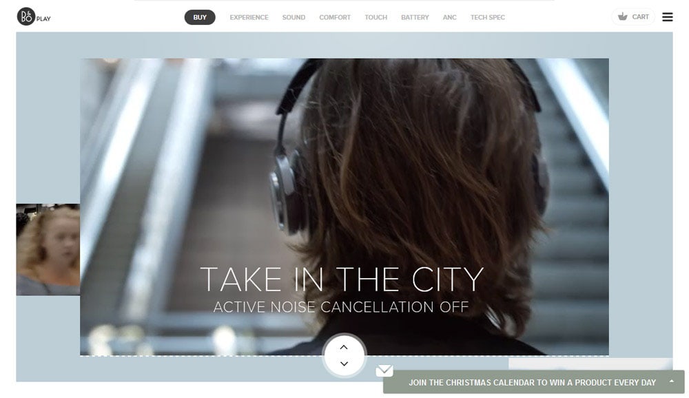
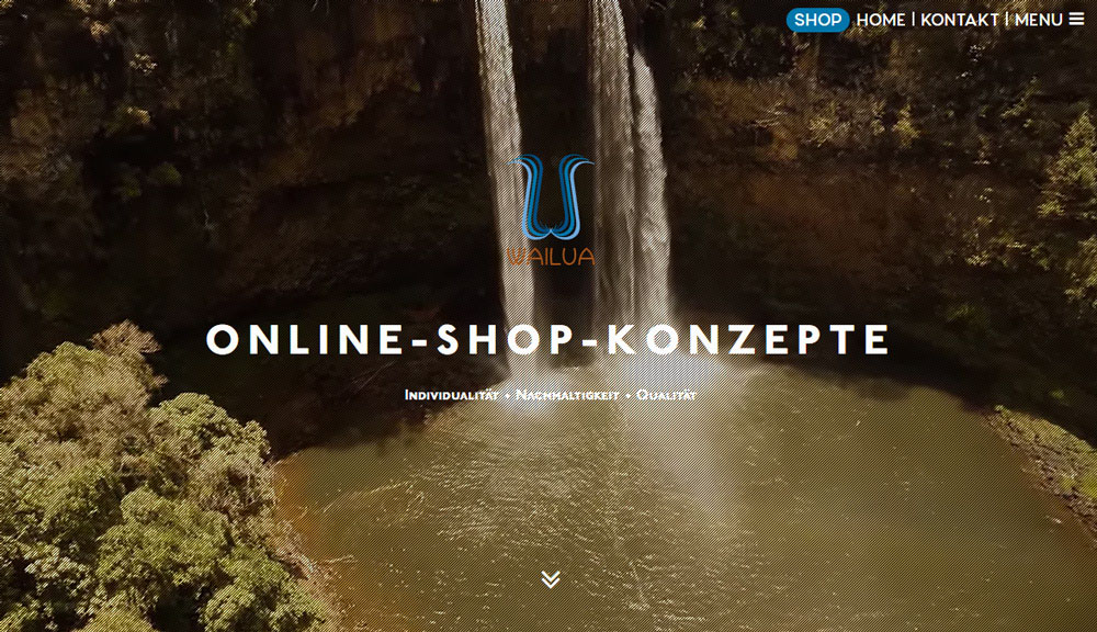
Video content has long been a favorite among users, and 2017 sees its integration into web design reaching new heights. Websites are beginning to feature videos with sound as the central element of their homepage. This trend replicates a cinematic experience, immersing users in the content from the moment they land on a page.
However, this approach requires careful consideration. Users should have control over the sound, with a toggle option to ensure accessibility and prevent irritation. The video itself must be of exceptional quality, paired with compelling audio that enhances the narrative.
Virtual Reality Without Headsets
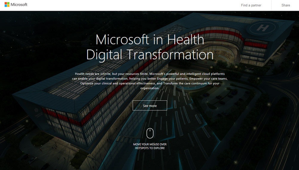
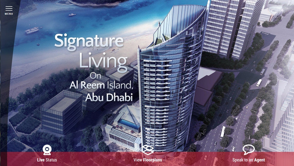
Virtual Reality (VR) is one of the most talked-about trends, and its influence on web design is undeniable. With more affordable VR devices entering the market, designers are experimenting with ways to offer immersive experiences without requiring specialized headsets. This includes 360-degree videos and interactive, three-dimensional visuals that bring a sense of depth and engagement to websites.
Incorporating VR-inspired elements can provide an edge in competitive industries. By embracing innovative technologies, designers can create experiences that captivate users and set their projects apart.
Enhanced Parallax Effects: Greater Depth and Interaction
Parallax scrolling has been a staple of modern web design, but in 2017, it’s evolving. Designers are crafting more sophisticated effects that add depth and realism to websites. Movements now include upward scrolling and layered designs that simulate a tactile experience.
The challenge lies in balancing creativity with usability. Parallax effects must remain smooth and intuitive to avoid frustrating users.
Simplified Homepages: Minimalism Meets Functionality
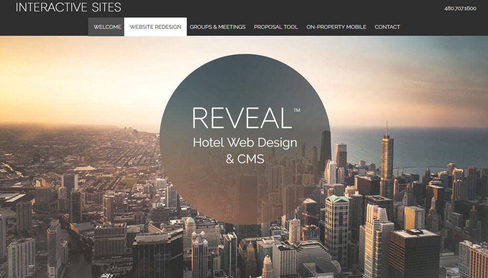
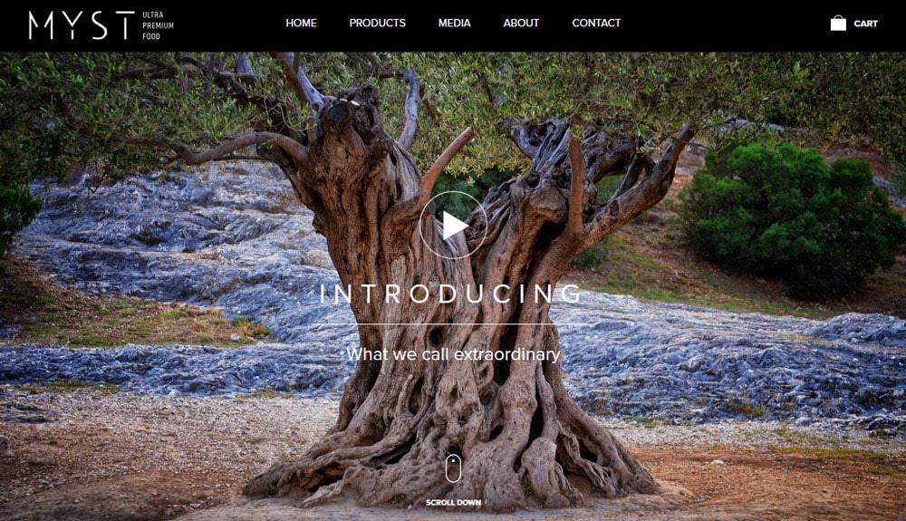
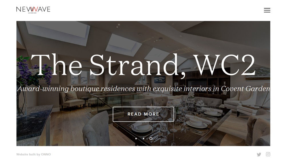
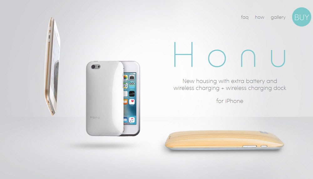
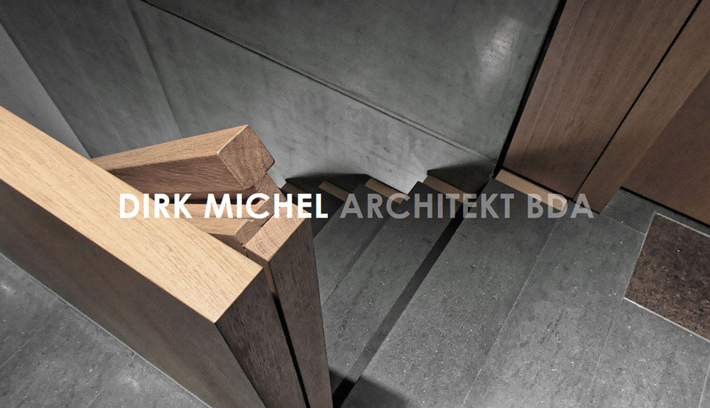
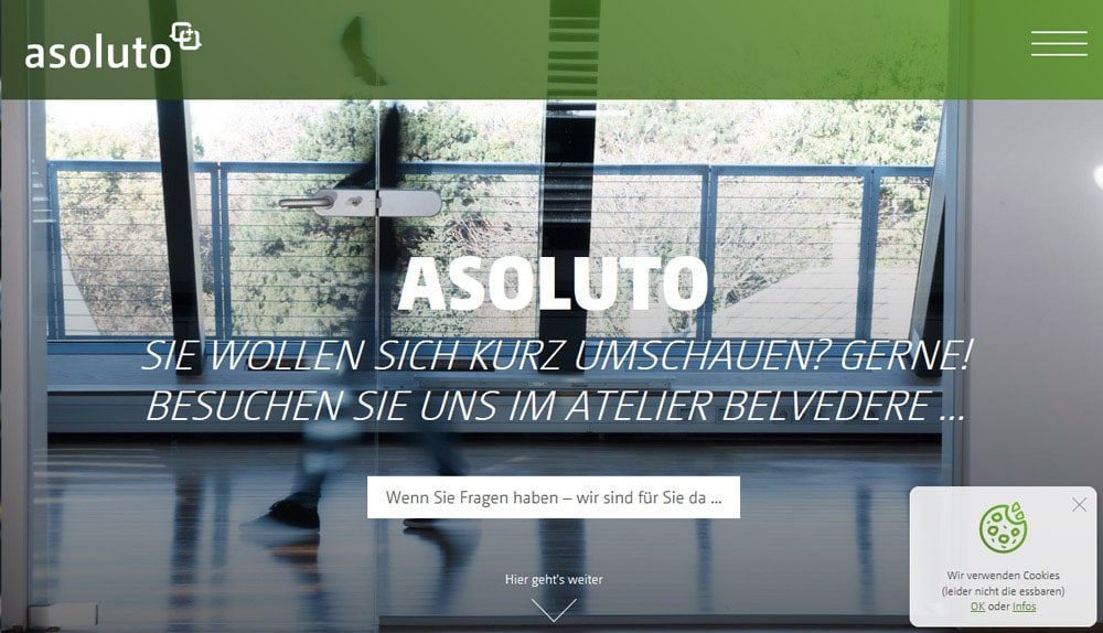
Minimalism continues to shape homepage designs, with many opting for simple, text-light approaches. These designs often feature just a word or two on the first screen, relying on scrolling to reveal additional content. This trend reflects changing user habits, particularly the growing comfort with scrolling, even on mobile devices.
To make this approach successful, designers must ensure that the minimalist hero area is captivating enough to encourage further exploration. It’s an opportunity to blend clean aesthetics with strategic functionality, appealing to both search engines and users.
Innovative Navigation Patterns
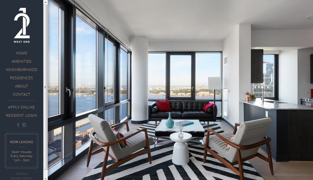
Navigation is evolving, moving away from traditional top-of-page menus. Designers are experimenting with hidden, pop-out, and side navigation styles, creating fresh and engaging user interfaces. This shift challenges designers to think creatively while maintaining intuitive usability.
The success of this trend hinges on clear user pathways. Navigation elements must be easily discoverable and function seamlessly across devices.
Tactile Design: Bringing the Physical World Online
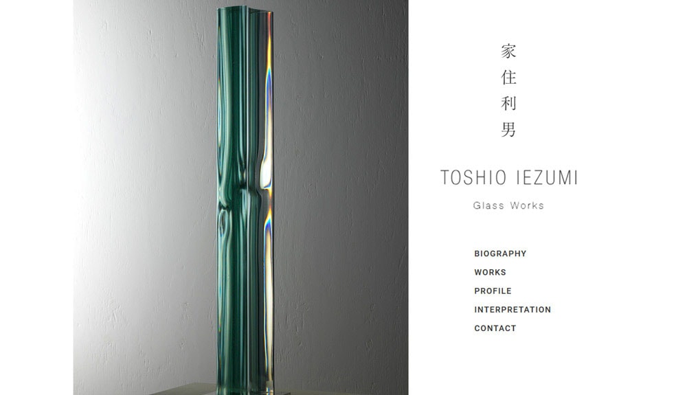
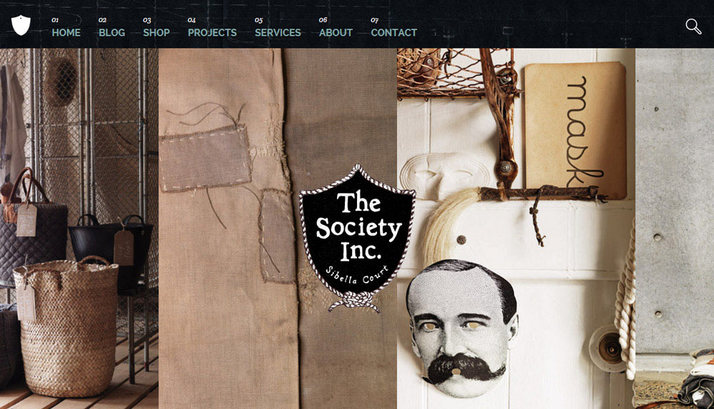
Web design is becoming more tactile, inspired by material design principles and real-world textures. This trend focuses on creating interfaces that feel grounded in reality, using natural materials and layered visuals to mimic the physical world.
Images play a crucial role, moving away from abstract illustrations to photographs and textures that evoke a sense of touch. This approach resonates with users, fostering a connection that feels authentic and engaging.
Neutral Color Palettes: A Natural Shift
Neutral color palettes are gaining popularity, marking a shift from the bright, neon tones of previous years. Greens, beiges, and muted shades derived from nature dominate designs, aligning with the tactile trend. These colors create a calm, harmonious aesthetic that appeals to users seeking a more grounded experience.
For web and mobile development firms, understanding this trend ensures designs remain relevant and appealing. Incorporating natural hues can enhance usability and complement tactile design elements.
Wearable Technology Shapes Design
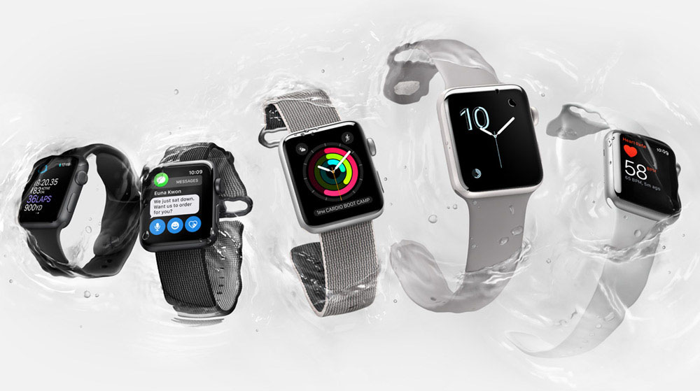
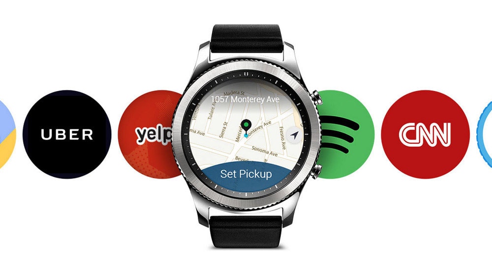
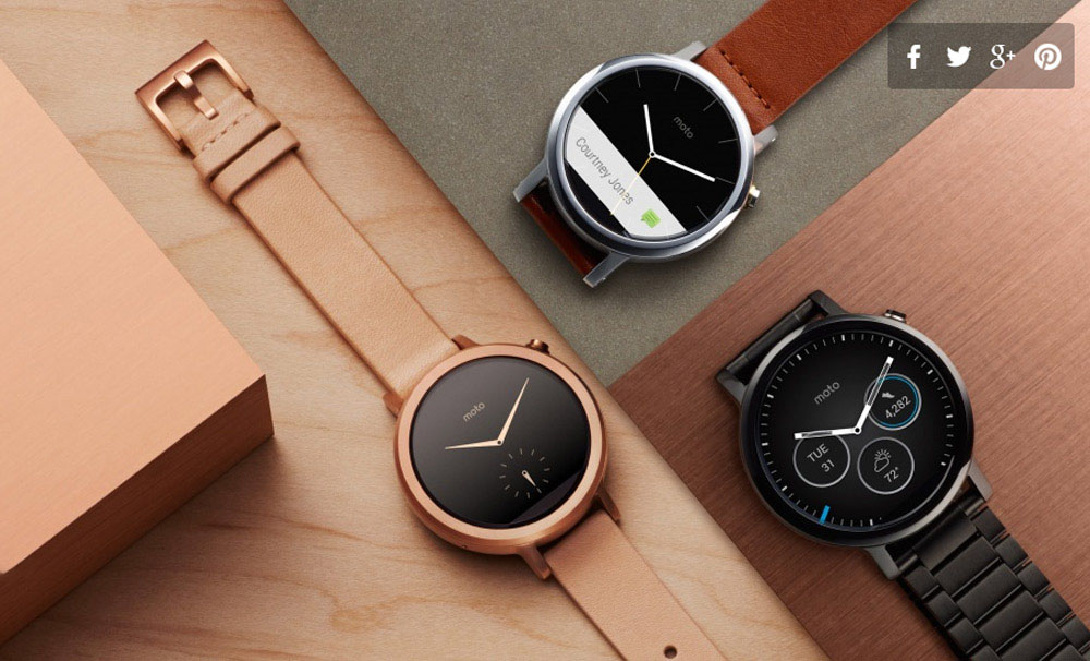
Wearable devices like smartwatches are influencing web and app design. This trend prioritizes simplicity and functionality, with larger typography and minimalist interfaces becoming more common. These changes reflect the need for seamless user experiences across devices.
For developers, designing with wearables in mind can open new opportunities. By anticipating user needs and creating adaptable solutions, businesses can stay ahead in a competitive market.
Custom Typography: Unique and Impactful
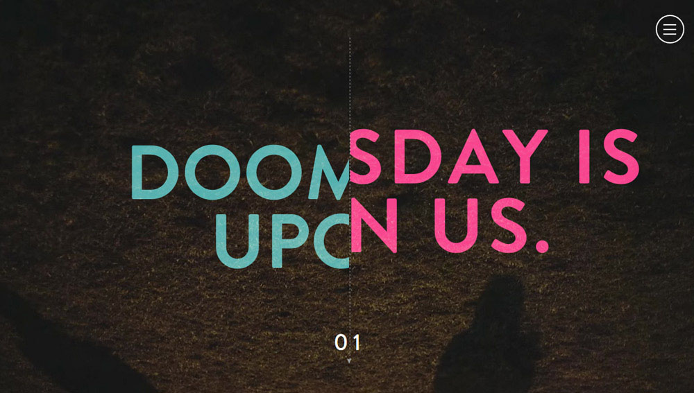
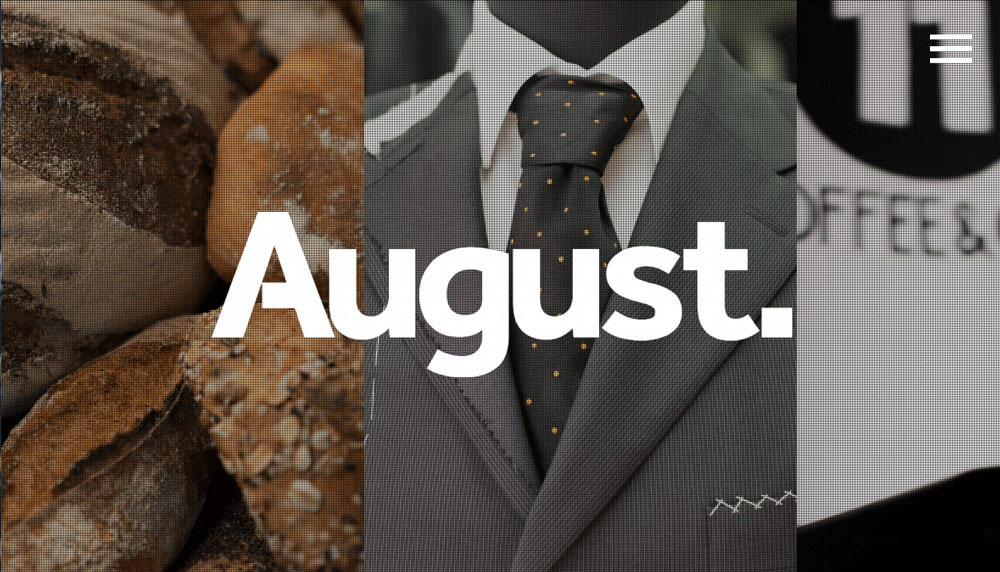
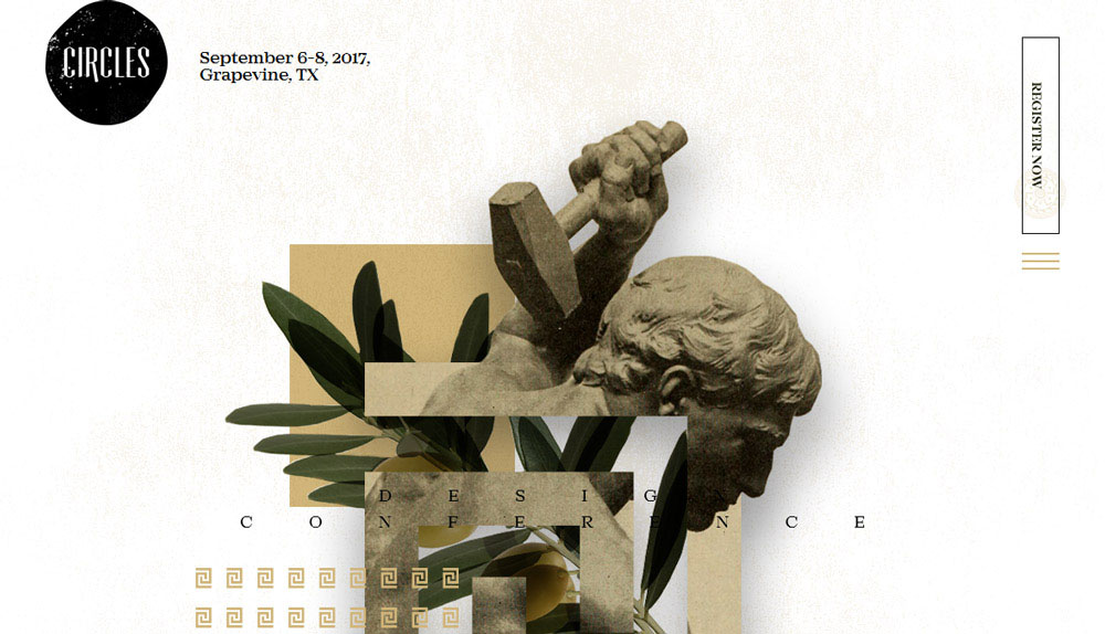
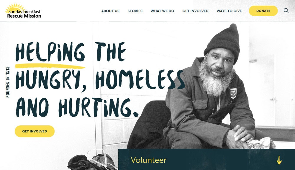
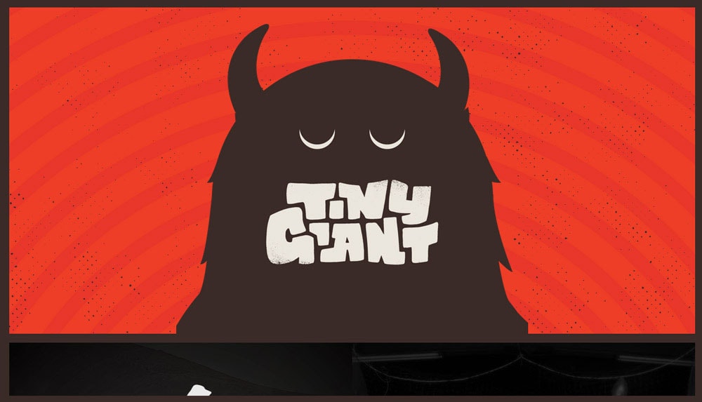
Typography continues to evolve, with designers exploring unique, bold typefaces to create visual impact. Custom fonts and vintage styles add personality to websites, setting them apart from competitors. This trend allows for creative expression while maintaining readability and clarity.
For those in the web and mobile design industry, investing in distinctive typography can elevate projects and leave a lasting impression on users. By balancing creativity with usability, designers can achieve a harmonious and engaging result.
Incorporating these trends into web and mobile designs ensures projects stay innovative and user-focused. By blending bold ideas with practical execution, businesses like S3Corp and others in the outsourcing field can deliver exceptional results that meet the demands of clients.
